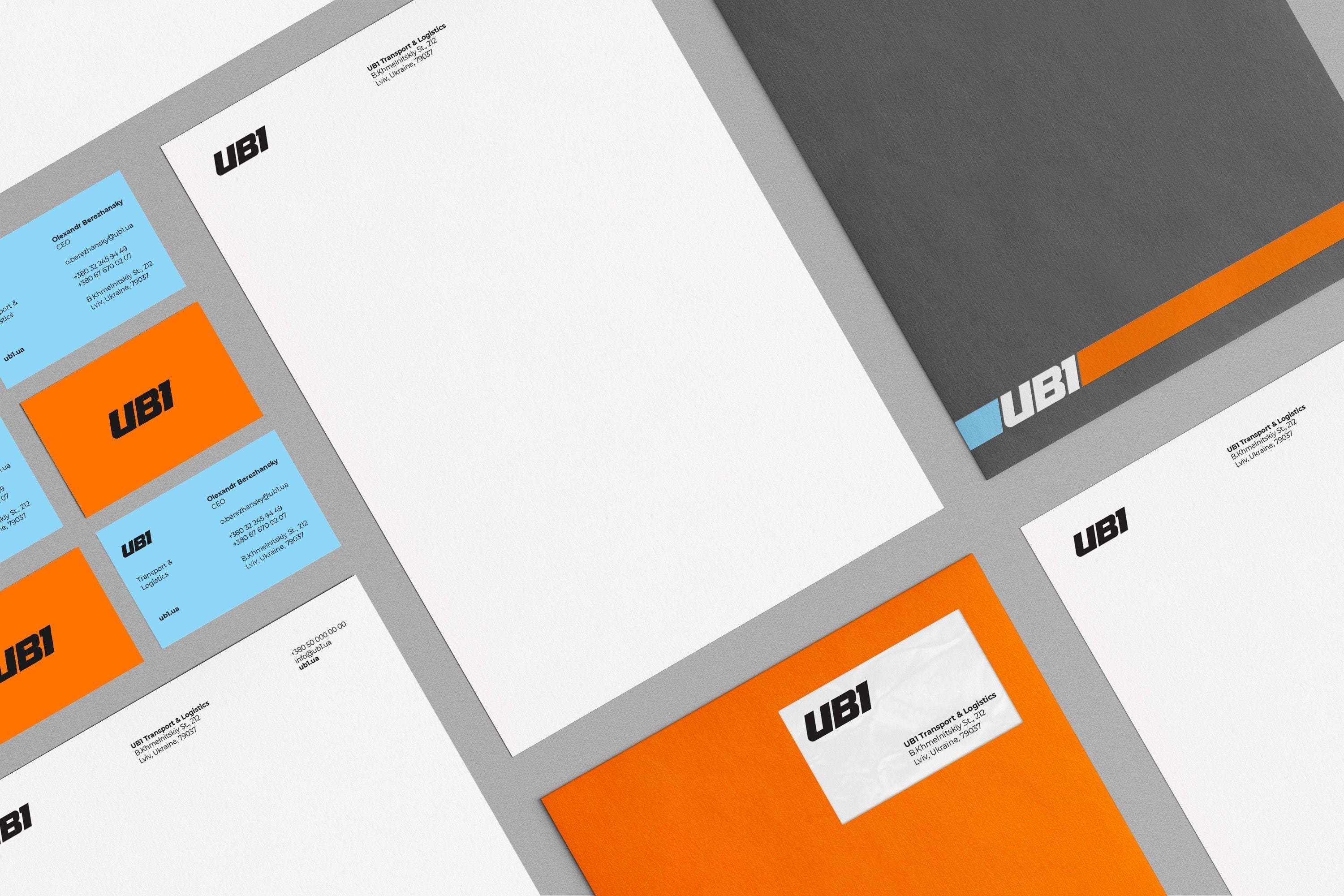
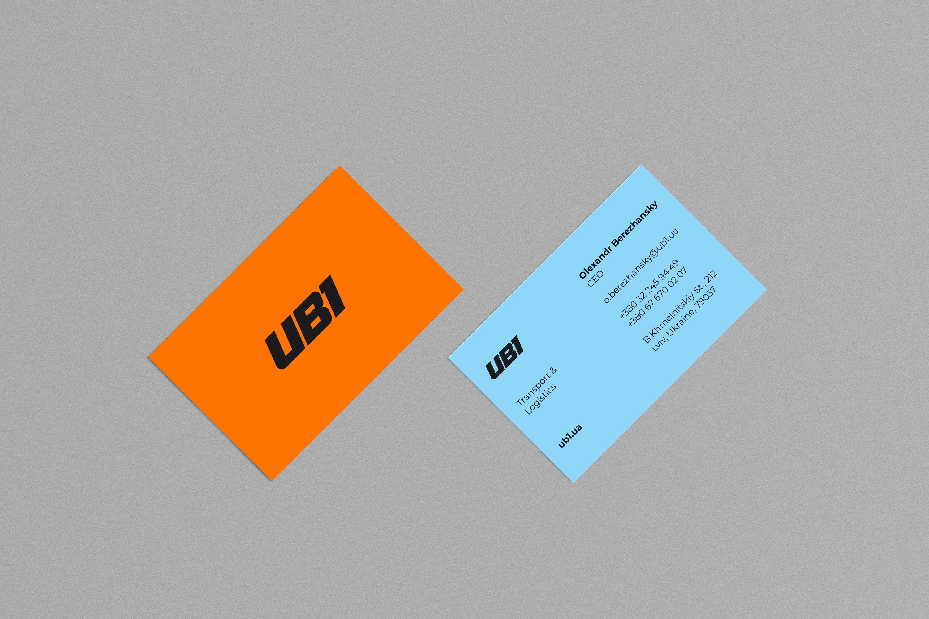
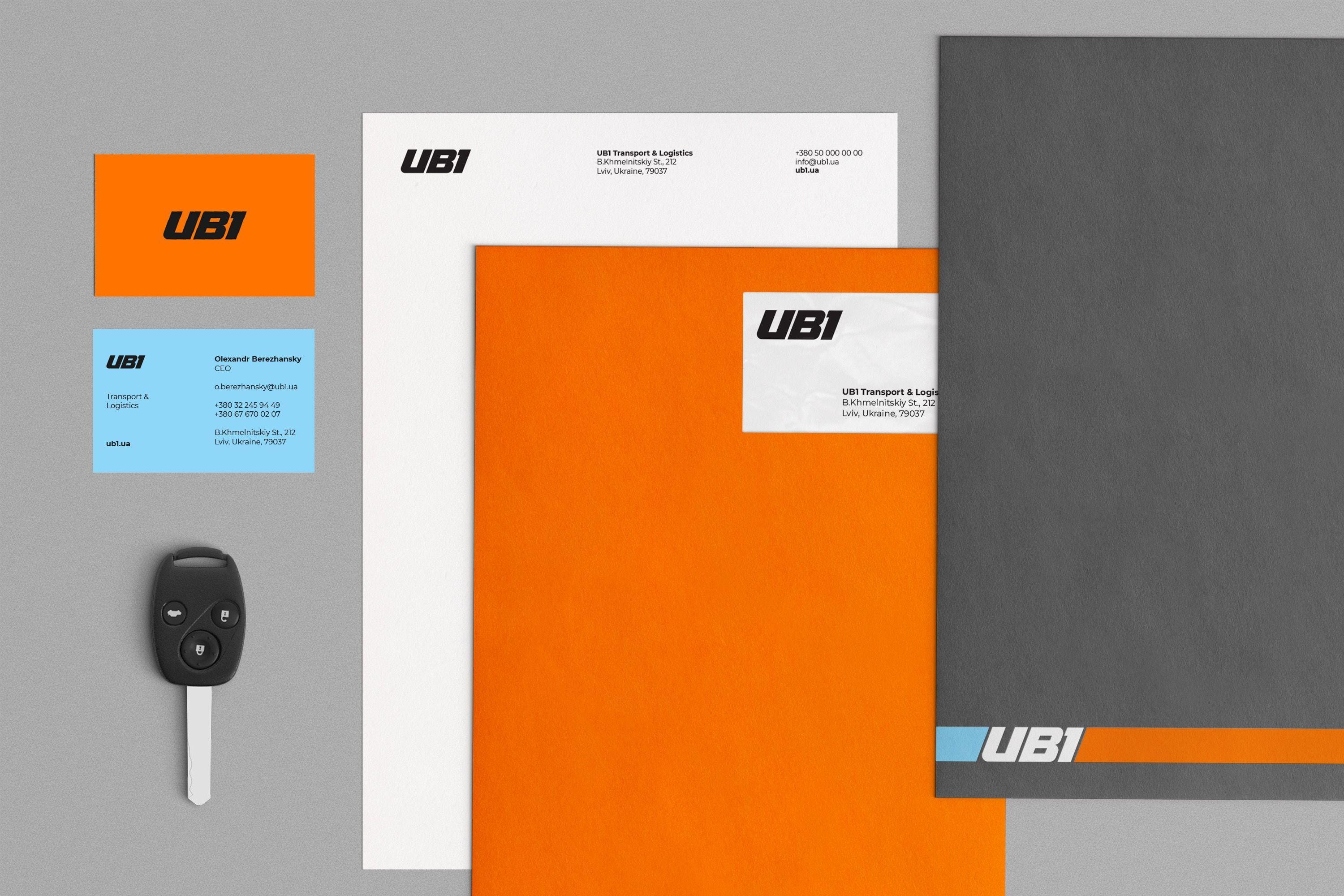
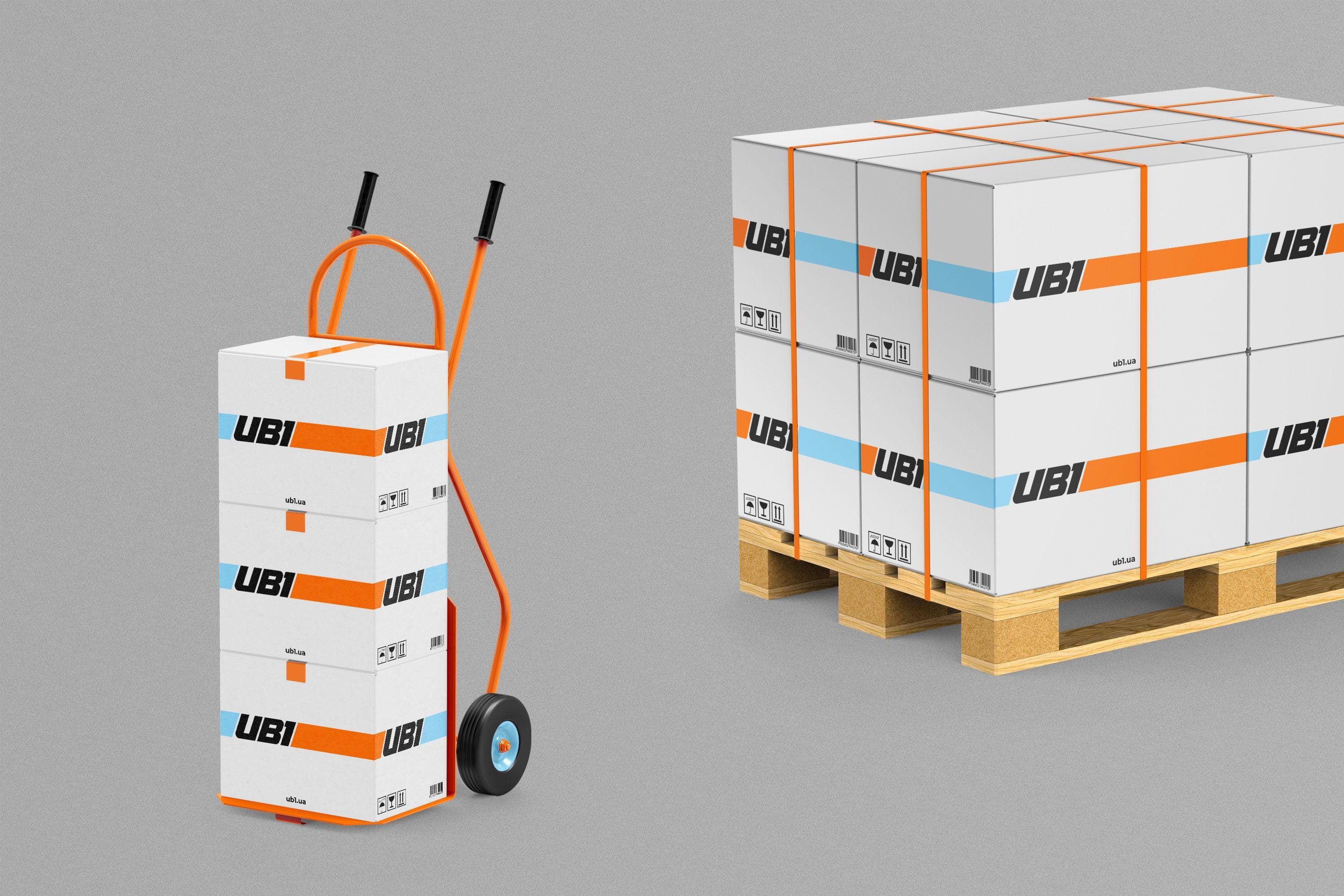
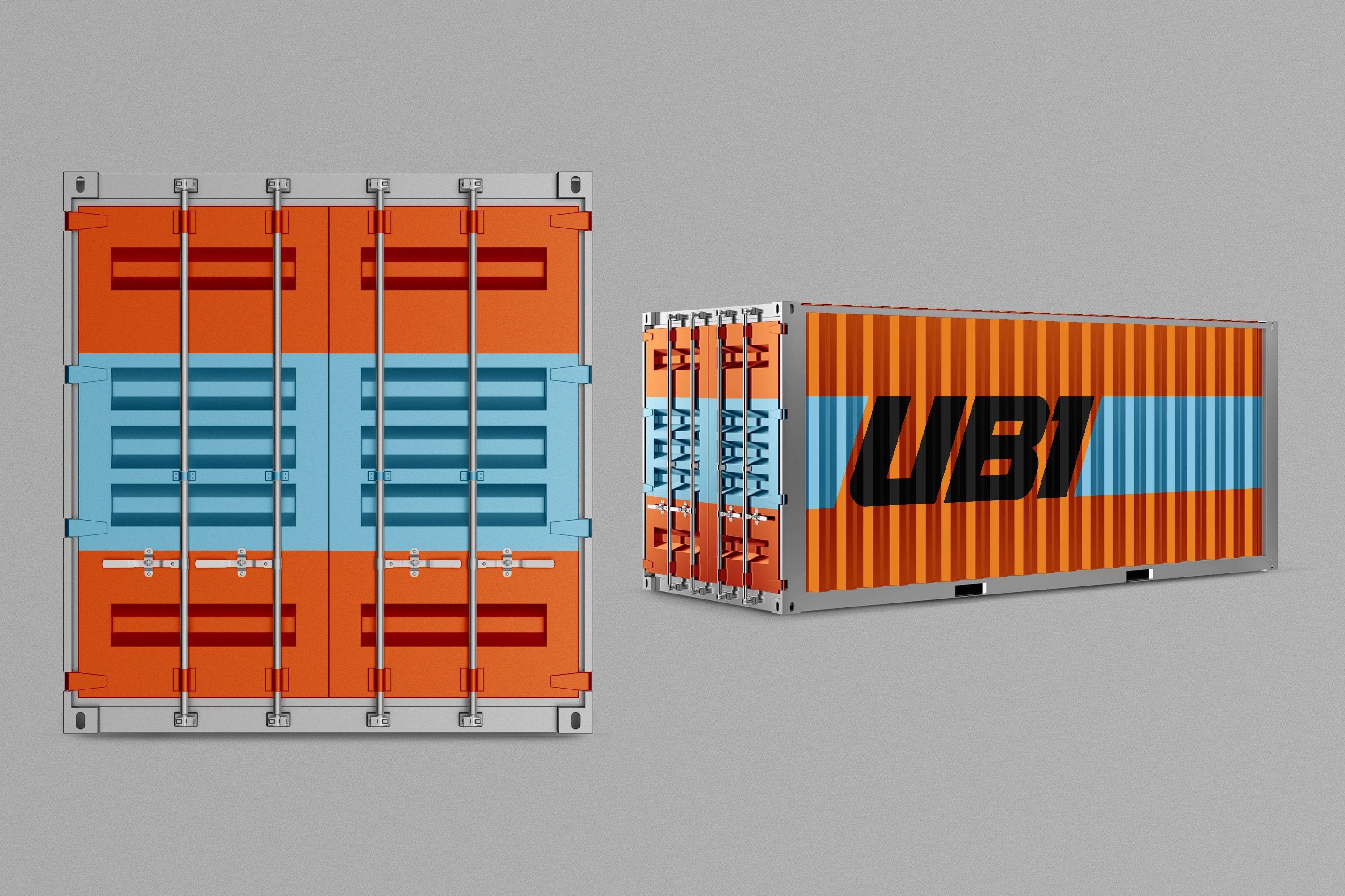
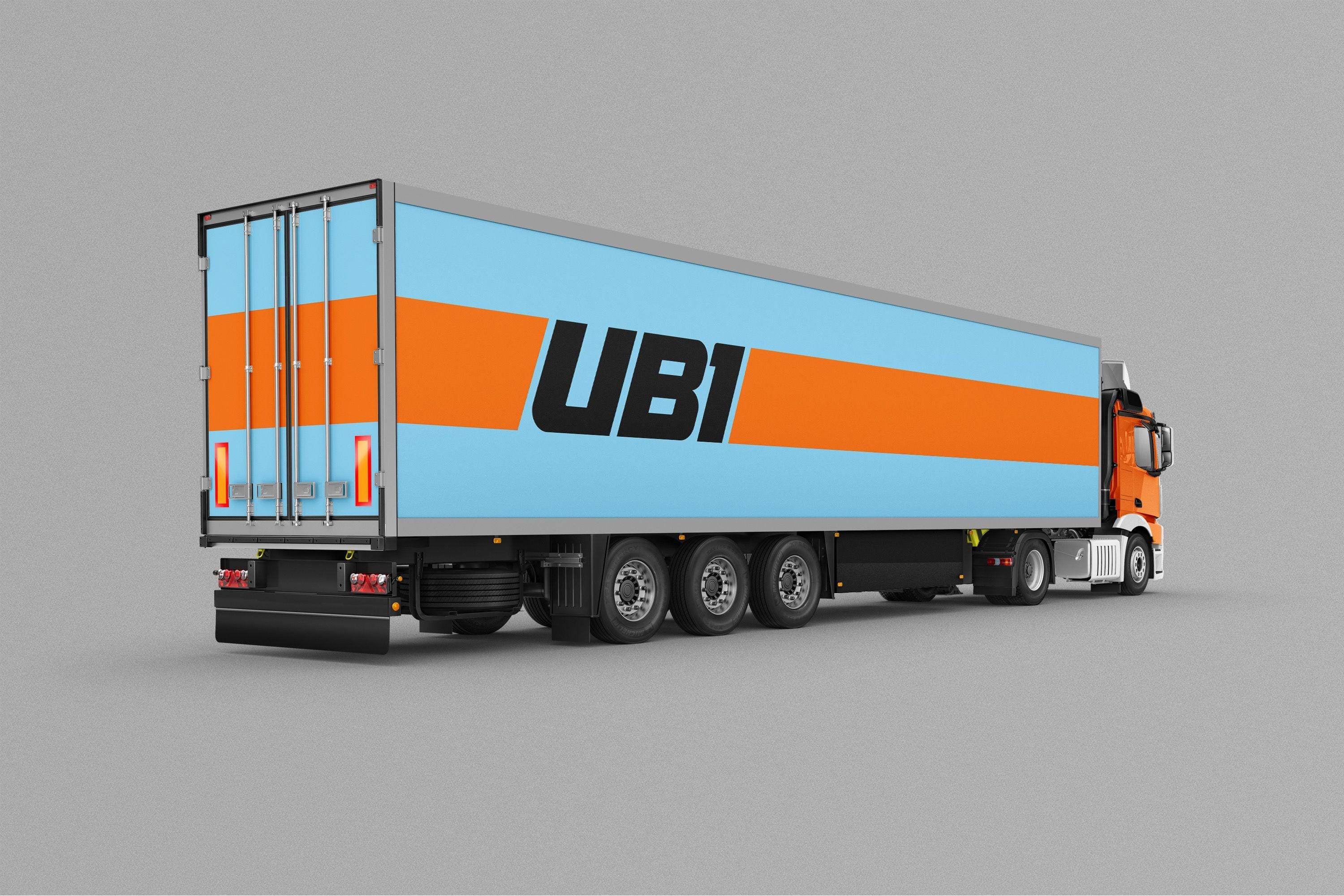
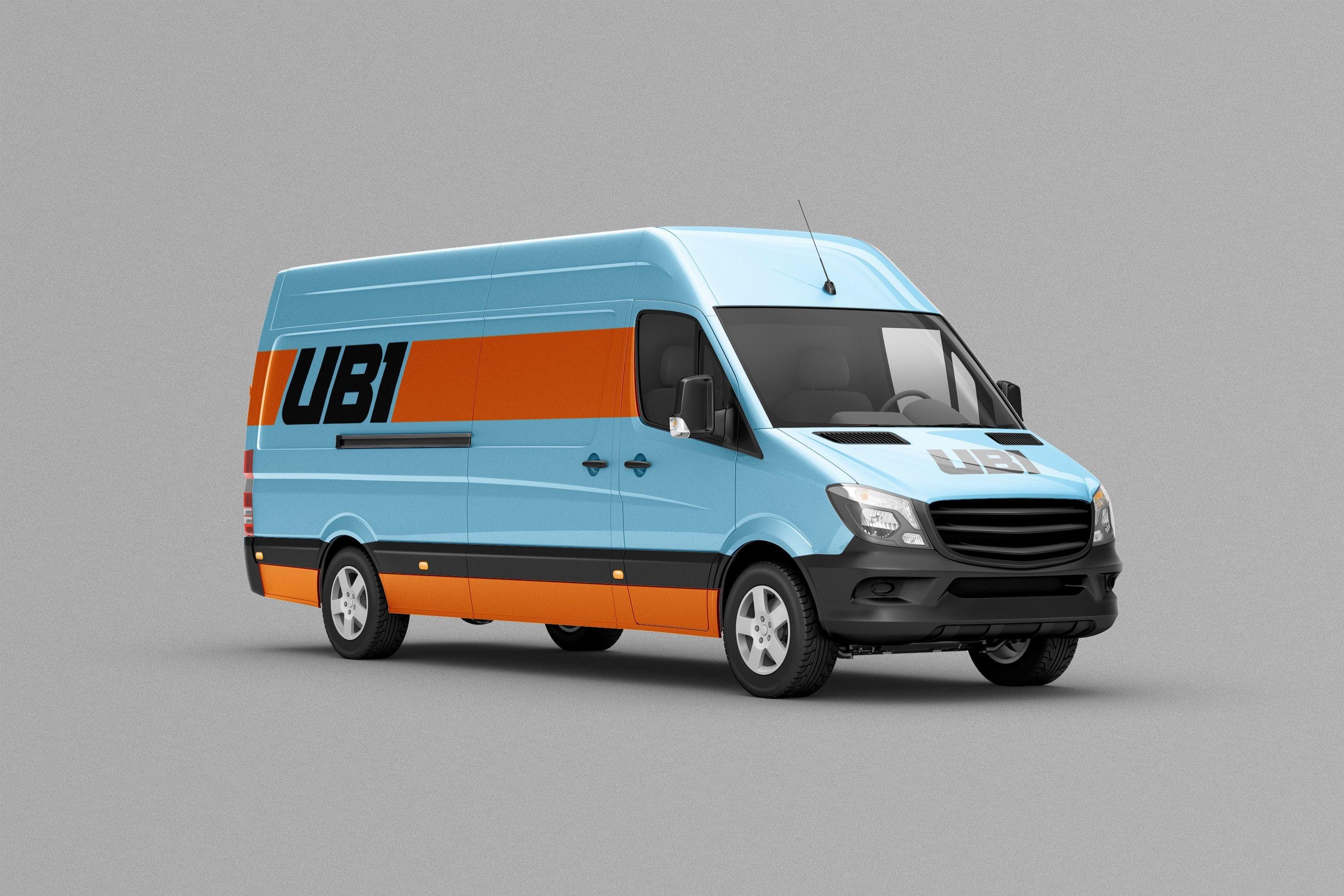
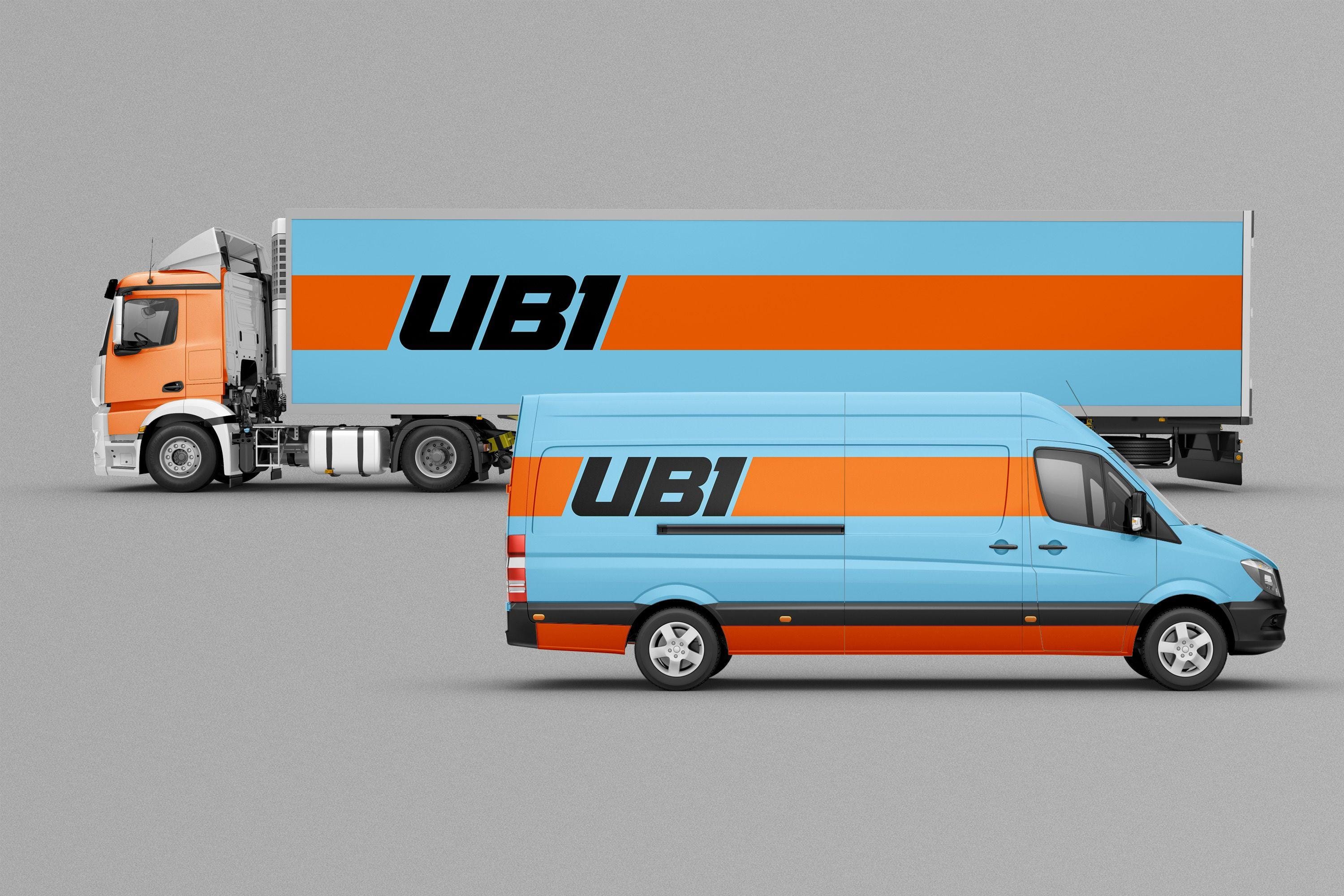
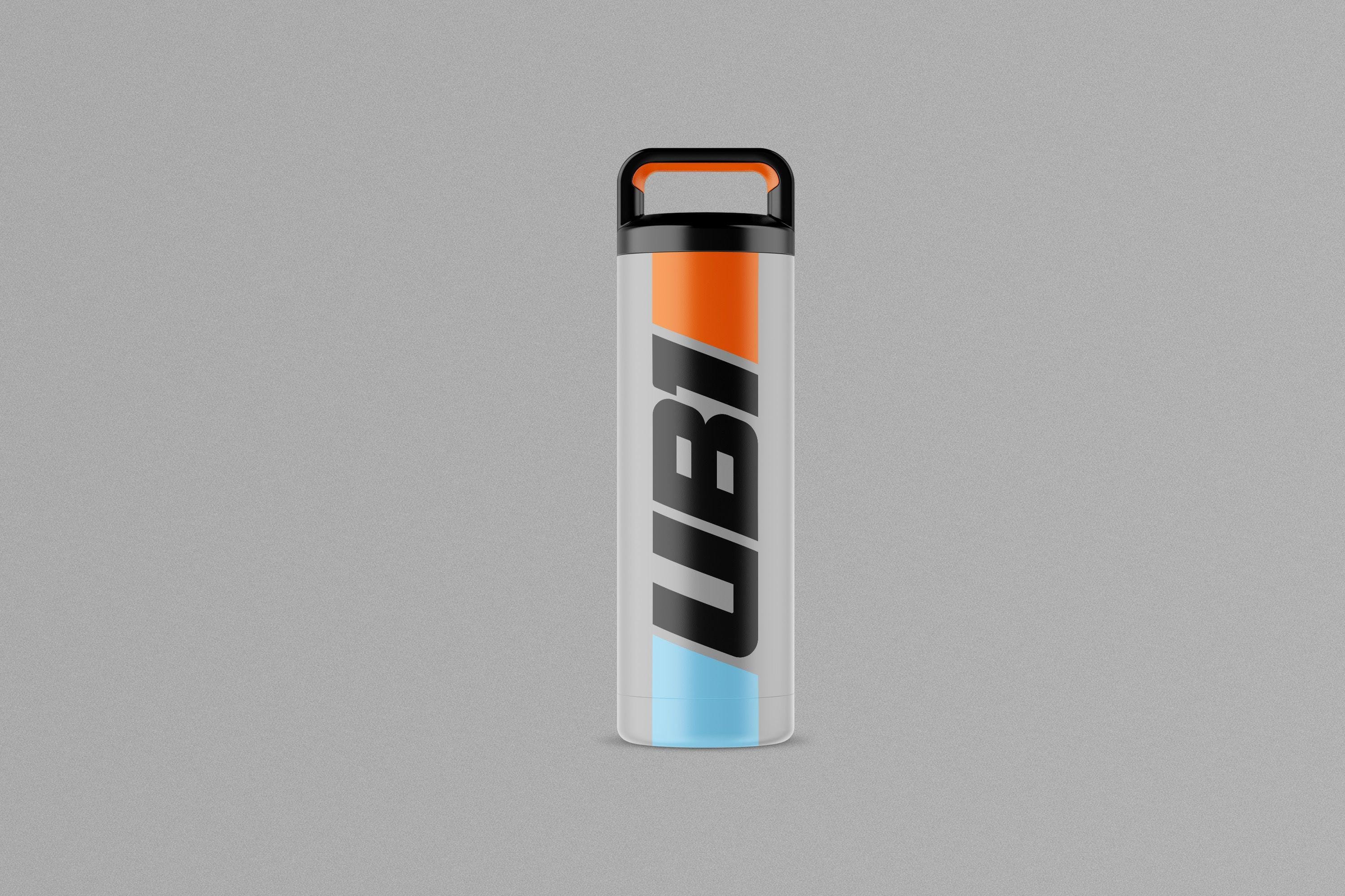
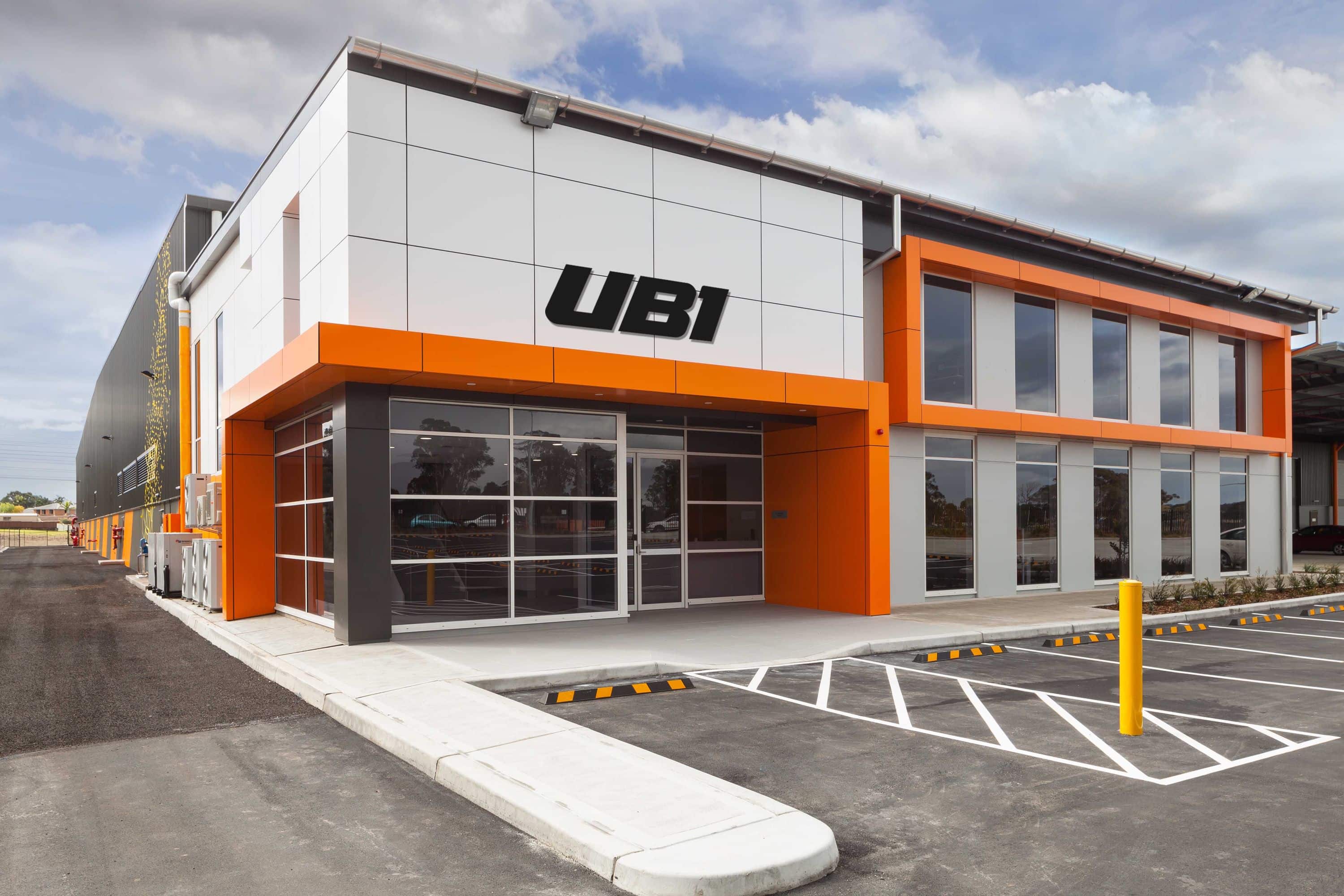
We conducted market research and discovered that customers often identify companies by their signature colors. For example, yellow and red are instantly linked to DHL, while orange and purple evoke FedEx. Our challenge was to create an equally strong and memorable color combination for UB1. However, vibrant packaging alone isn’t enough — it must be backed by a compelling idea that reflects the brand’s identity, values, and competitive advantages.
To find this idea, we drew inspiration from the rich history of motorsport, specifically the legendary rivalry between Enzo Ferrari and Henry Ford. Ford’s GT40 famously defeated Ferrari by winning the Le Mans race four consecutive times, breaking Ferrari’s long-standing dominance.
This powerful story inspired us to make dynamic racing style the core metaphor of UB1’s corporate identity. While delivery isn’t exactly a race track, UB1 shares many traits with racing brands — speed, precision, and timing. Time is a crucial KPI for UB1, and this identity clearly communicates the company’s commitment to fast, reliable service.
brand strategy
Naming
branding
packaging design
brand guidelines
brand activation
